
Fourteen years ago, Amazon looked unstoppable, and most retailers were losing ground to it. Mirakl was founded with a different idea: what if retailers fought back by becoming marketplaces themselves? Open the shelves to third-party sellers, grow the range, and don't hold the inventory. It was a new business model, and it asked retailers to take a leap. So we built a brand to earn that trust. It had to feel safe, professional and dependable, and it did. For more than a decade, it got us into rooms that might otherwise have stayed closed.
But brands, like the businesses behind them, don't stand still.
With Mirakl, marketplaces went from a bold bet to a proven playbook. Decathlon (opens in a new tab), Macy's (opens in a new tab), Lowe’s (opens in a new tab) and 450+ customers across the globe showed what's possible when a retailer opens up its storefront, and in doing so changed how the industry can compete at scale. The doubts we were built to answer faded. Our products got smarter, and the category we helped create started looking to us for direction.
Our brand, meanwhile, was still saying "trust us" when customers were asking "what's next?"
It wasn’t only the category of marketplace that changed. Mirakl stopped being one product for one buyer. Brands, sellers and enterprise retailers all came to us wanting solutions that answered real problems and could scale their ambitions on day one. B2B businesses came too, as distributors and manufacturers set out to launch marketplaces of their own. Each of those audiences needed a different proposition, but our brand had been built to speak to only one of them. Our solutions now support the objectives of entire eCommerce teams, extending to dropship, inventory and financial services, and to two new products, Mirakl Connect and Mirakl Ads. A single story no longer fit.
Now enter agentic commerce. Products need to be discoverable and ready to transact for AI as well as for people. Every retailer and brand has to ask itself: is our commerce tech stack ready for agentic? We want to help answer that question, and the company answering it should look and sound the part.
Our new positioning
The biggest driver of the refresh is our new positioning: Mirakl is the operating system for intelligent commerce. We make the complexity of commerce growth simple, for the people and teams driving progress in businesses navigating change.
We chose the operating system because it describes what Mirakl does rather than what it is. It gives customers more control and more visibility over their business. It sits between the abstract and the literal, and it ties our different solutions together, unifying our value into one system rather than just a list of products. “Intelligent commerce” was chosen because it is an emerging industry phrase we can own, and I expect it to outlast “agentic commerce”. It also carries a double meaning: it points to AI-driven commerce, and it is simply the smart way to do commerce. Together, the two ideas put us at the forefront of where the industry is heading, in a line short enough to remember.
Keeping the DNA
We approached this project as an evolution, not a revolution. Before changing anything, we looked carefully at where the equity in the Mirakl brand really sits: what customers recognise, what they trust, and what still reflects the spirit in which the company was founded. Fourteen years of recognition isn’t something to discard, and the ambition behind Mirakl hasn’t changed. The goal was a brand that is unmistakably Mirakl, but new, fresh, and ready to carry all that was built into the future.
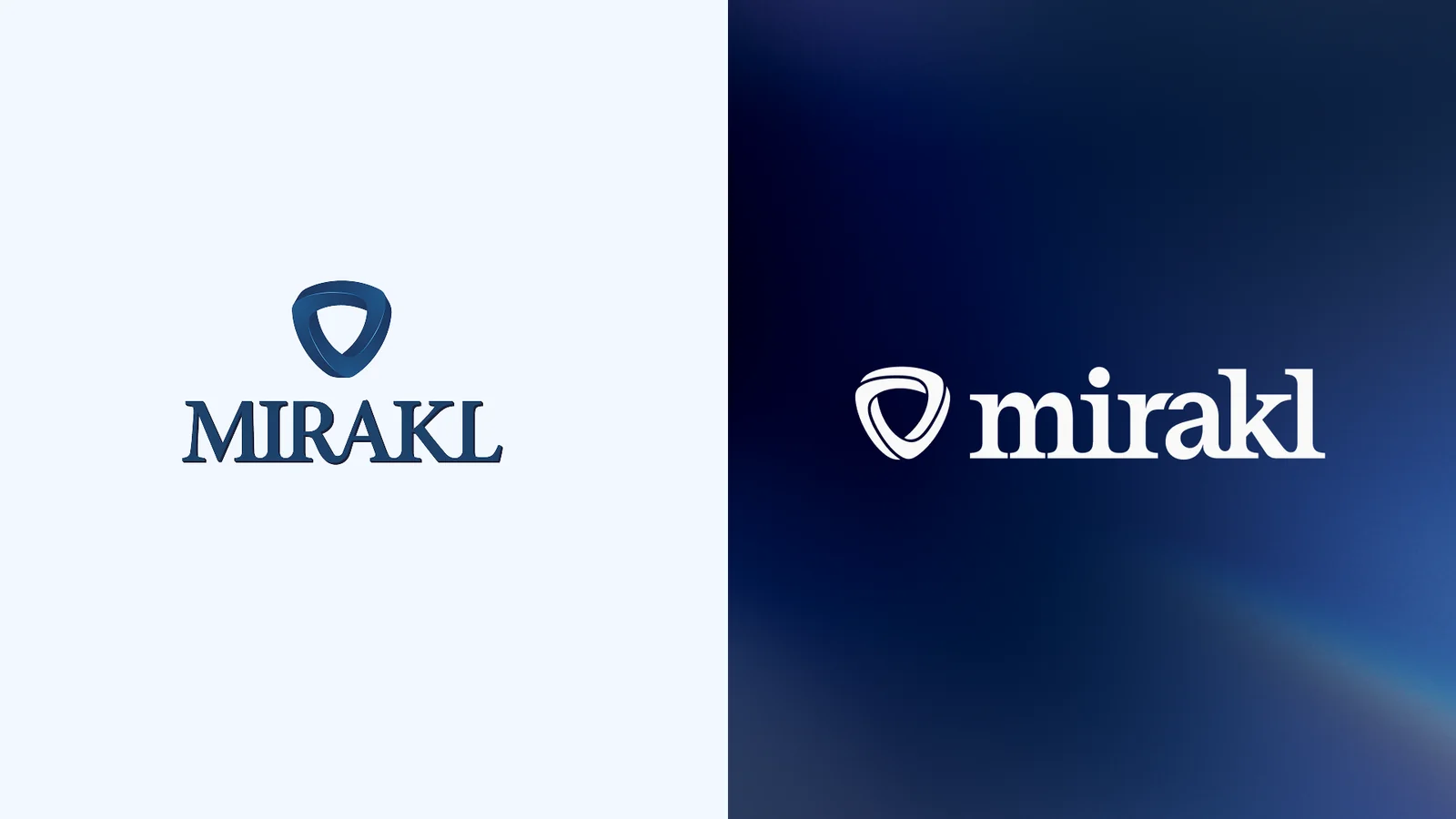
The logo was the clearest answer, and we treated its two parts differently. The logomark carried the most recognition, so we refined it rather than replaced it. The dimensional, shaded form of the original has become a clean, flat mark that is friendlier to digital applications and holds its legibility whether it appears as a favicon or a billboard. For our biggest moments, such as film end cards, the symbol still becomes a three-dimensional object set against our gradient, used sparingly so that it keeps its impact.
The wordmark we recreated completely. The original uppercase letters have given way to a lowercase wordmark that is friendlier and more approachable. We kept the serif, because it carries the authority and expertise that customers have always associated with Mirakl. We also kept the relationship between the “r” and the “a”, but where the old letters joined, the lines now run parallel. It is a small change, and it is the kind that makes a wordmark feel new while still being recognizably ours.
Our products received the same care. Mirakl Connect, Ads, Payout, Catalog and Platform now share a single sub-logo system, so each is clearly its own offer and part of one family.
Type, color and composition
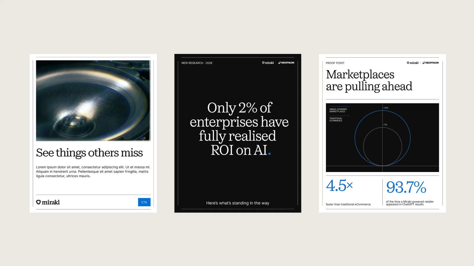
Oceanic Text sets our headlines. We chose it because it is authoritative and sophisticated, yet warm, with enough character to feel like it was written by people. It carries the confidence of a market leader without the distance. Inter sets everything else. We chose it for its simplicity and legibility, so the message always comes first.
Color followed the same thinking. We deliberately stripped the palette back to two strong neutrals, Cloud white and Obsidian black, and let them do most of the work. That left room for the one color that is unmistakably ours: Mirakl blue, a confident cobalt. We use it sparingly, for calls to action and the one data point that matters, so that when it appears, it makes an impact.
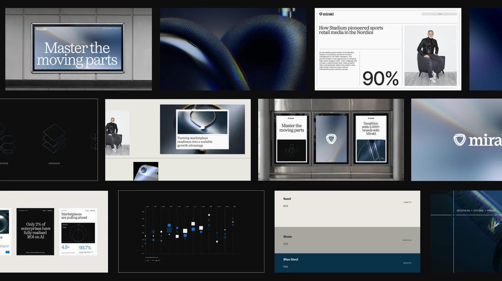
A key part of our identity is the Intelligent Grid. Content and keylines flex with it to create bento-style layouts that organize and separate imagery, typography and other assets. It brings structure and precision to every composition without making it feel rigid.
Light, imagery and illustration
Our gradient is how we make blue more ownable. It is always shifting, like commerce itself, and it brings visual interest to our digital applications.
For photography, the idea is rooted in our French heritage and is called “Le Rayonnement”: radiant light, designed to drive influence, growth and impact. We create the effect with a custom AI prompt, which lets us produce distinctive, ownable imagery at scale. We crop in close, showing a new side of the products our customers sell. The result makes us look at home in the world of commerce without being mistaken for a retailer, and every image stays anchored in our customers’ success.
Where photography isn’t tonally right, illustration steps in. Our illustrations are built from strong geometric shapes, a nod to our engineering roots, and grouped by theme: growth, acceleration, simplification and expansion. Together they tell the story of how we help our customers.
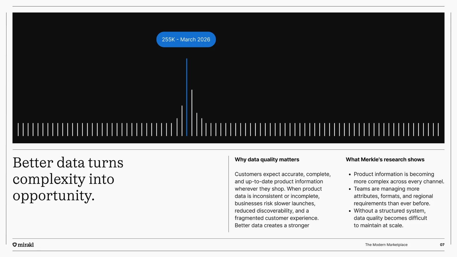
Data is central to our work, so we gave it a strong color palette and bold shapes. Big numbers and clear data visualizations let us lead with insight. And the blue square acts as a punctuation mark: it emphasizes strong copy, and it is a visual motif in our motion language.
An AI native brand identity
We’re not just designing for today. We’ve built the foundations for AI-driven creativity at scale, transforming our brand identity into an intelligent system that AI agents can understand, apply and build upon.
Our brand guidelines go far beyond a traditional PDF. We’ve translated our design language into machine-readable rules, embedded directly into Claude and Dust agents and connected to real design components in Figma. Rather than interpreting the brand from scratch, our agents build from a shared system, ensuring consistency across teams, tools and workflows.
This extends to our visual identity. Using Gemini and carefully engineered prompts, we can generate distinctive imagery with consistent lighting, colour and character, bringing the same creative direction to everything from our website and paid media to reports and campaigns.
With these foundations in place, we’re developing generative tools that make high-quality, on-brand content faster and easier to produce at scale. Our next ambition is to connect our design agents with content creation and demand generation workflows, moving towards fully autonomous, zero-touch campaign production.
The result is more than a new visual identity. It’s a brand built to scale through AI.
Reinvention
Early in my career, I was lucky enough to work with Sir Richard Branson on the Virgin brand, and something he said about branding has stayed with me ever since:
“Branding demands commitment; commitment to continual reinvention; striking chords with people to stir their emotions; and commitment to imagination. It is easy to be cynical about such things, much harder to be successful.”
That is the standard we’re holding ourselves to. This rebrand isn’t a finish line. It’s the start of a brand that keeps reinventing itself, keeps stirring emotion, and keeps earning the confidence of the people who rely on it. The best work is still ahead of us.
Welcome to the new Mirakl.
Thank you
A rebrand is never the work of one person, and I’m grateful to everyone who made this one possible.
To Philippe Corrot and Adrien Nussenbaum, the founders of Mirakl, and to our leadership team: thank you for trusting me with your brand and your reputation. I don’t take that lightly.
To our partners at Koto: Sam, Brya, Cat, Tom, James and Dan. Thank you for your craft, your patience and your willingness to push us further than we’d have gone alone.
To my colleagues on the Mirakl Marketing team: thank you for the care, energy and long hours you put into every detail, and for carrying this work from idea to launch. A particular thanks goes to Romain, Gavin and Mila.